Tuesday 18 May 2010

Wizard of Oz Presentation


For my wizard of oz presentation I created a film with images and stop-motion animation, I wanted it to be full of different images of different scenes thought out the wizard of oz story with added animations as well I was able to but the images and animation together using windows movie maker, I also created pages for the tittles of each chapter which i then added text on to, windows movie maker also let me put music on to my film so I added 'follow the yellow brick road' from the film.

Sunday 16 May 2010

PES Animation

Western Spaghetti


When I first saw western spaghetti I loved it, I liked the use of different objects used to represent the real ingredients, instead PES has used every day objects such as pin cushions for tomatoes, pick-up sticks for spaghetti, post it notes for butter and wool for cheese, these object are then brought to life using stop-motion animation.

Link to PES animation http://www.youtube.com/watch?v=qBjLW5_dGAM&feature=related

Monday 10 May 2010

Robert Bradford

Today I came across Robert Bradford, who is a 2D and 3D artist, he has started using materials that have been used and are weathered in someway, I like the random collections of colours and different forms. From looking in a draw of random old toys he realised that he could make work from them decided to make dogs and some other objects.


Robert Bradford, Terrierist2 2,

I like how Robert has cut up and stitched together used soft toys to make a dog. He also used torches for the eyes, this dog still has a feel of been a toy.

Robert Bradford, Soft Dog Commission

Saturday 8 May 2010

Red Nose Studio


I was searching for some 3d artwork to help me make a set for my wizard of oz and I came across Red Nose Studio, this was just what I was looking for I wanted my own work to look like this. I like how the sky looks although it was painted and everything was hand made even every flower, the colours have a dirty feel to them as they are not too bright and bold.

Red Nose Studio, Poppy Field.

Red Nose Studio, Delivery Magazine

After seeing this image i thought about making my Toto out of clay, I could this hard to make and i couldnt get the shape I wanted, after it had dryed Ipainted it black and covered it with bits of yarn for its fur.


Here are some of my own images, made with found images and reassembled on Photoshop. For my tin man I used different tin object placed together using Photoshop but the Dorothy was made by images out of magazines collaged together, my Toto is hand made out of fabrics but I have also worked on him on Photoshop by giving him a human eye and a bow.


Thursday 29 April 2010

Maps


Drawing Practice

from drawing practice and researching in to maps Ihave started to look at maps in a completely different way to what I have before. I just saw them as something to tell you were to get from A to B but now it has opened a new way of thinking, researching all the different kinds of maps was really interesting and inspiring. Drawing the UK as a map from memory was so much harder than I thought it would be even though every one knows what the UK looks like it still was very hard to draw. I found this a great challenge. Been able to create my own fantasy island map was really interesting.
                                 Sara Fanelli, map of my day, 1995

Tere are so many different aproches to mapping sara fanelli has mapped her day, bright and colourful hand drawn child-like drawing.


                                         Paula Scher, The World, 1998
Uing typegoraphy to fill in the spaces.


               Kisaburo Ohara, A Humorous Diplomatic Atlas of Europe and Asia, 1904


illustrating the world as objects and animals.


Hereford 'mappamundi' 15th century

This map is mappamundi meaning mappa is cloth and mundi is of the world.

Wednesday 28 April 2010

Drawing practice

Exploring with ink bubbles, popping ink filled balloons, graphite and inked tennis balls thrown at paper and creating an image from smoke on paper. The ink bubbles were fun to experiment with and I liked the way you could never create the same bubble each one was unique. I also like the effect of the smoked images which was a new and existing different approach for me.


Rowland Flexner-ink bubbles

Anna Barriball- ink bubbles on top of photographs


Henry krokatsis-smoke drawings


Tim Knowles-tree drawings

Wednesday 21 April 2010

David Hughes


I like David Hughes work for his line quality and his use of pastel colours and the vintage aesthetic in his work. He also uses a border line around all his work which you don’t normally see other artist work.

Saturday 17 April 2010

Studio aka

Studio aka is a London based animation studio that does personal projects such as lost and found illustrated by Oliver Jeffers and the varmints. They also do commercial projects such as Lloyds TSB and coca cola adverts.

Studio aka, lost and found, Oliver Jeffers
                                              Studio aka, Varmints


Studio aka, Lloyds TSB


Wednesday 14 April 2010

Exhibition Review

Manchester Art Gallery

Fantasies, Follies and Disasters, The Prints of Francisco de Goya

This exhibition shows some of the fantastic prints of Francisco de Goya, even thought this exhibition is small there is loads to look at, you could star at one of Goya’s prints for ages to work out what’s really happening in the print they are dark and eerie, but there is more to Goya’s etchings that first meets the eye. There is depth to these prints you have to look closer at them and really look in to the detail of these small prints.


The subject matter of these works is about fantasy, war and follies I like the idea of fantasy and that anything could happen in his etchings but they seem to be horrifying and disturbing. The purpose of the exhibition is to present a surreal situation which you can relate to it involves the audience and draws them to look closer at the etchings.
Francisco De Goya, Disparate de Miedo (Folly of Fear) ,1864.


Some of Goya’s most famous print were war subjects, Disparate de Miedo (Folly of Fear) is also about war and death. Some of his famous war subjects were horrifying they had a representation of violence and torture.

This collection was made up of 30 etchings, he has also used aquatint and dry point, they are all framed at around eye level equally spaced and at the same height, the collection also has a piece in the middle which is by Jake a Dino Chapman, called the Disasters of war this was inspired by Goya’s etchings.
Jake and Dino Chapman, Disasters of War 1993


‘The works are all drawn from Manchester Art Gallery’s superb collections, and have not been exhibited together as a group for over 20 years. It includes over 90 rare first-edition examples of etchings which were purchased in the early 1980s.’ press release,18.03.2010, www.manchestergalleries.org is great that these prints have been shown again in a group to let new generations appreciate them as well.


The display is a great way to look at the etchings and relate to the Chapman’s piece in the middle it lets you look at the work then refer to Disasters of war after looking at each one. This was an interesting way of looking at the exhibition as you have both 3d and 2d illustrations and you are able to look all the way around the Chapman’s piece which gives you a perspective of the work.


The exhibition was disturbing and existing, I like to look at fantasy and the stories behind it I like trying to work out what’s happening in the image, there is a fear corruption and inhumanity which reflects on the war poverty and the hatred. It was believed that this has come from his illness which left him death. He has an extraordinary imagination which he illustrates satire and cruelty which defines his work in this medium.


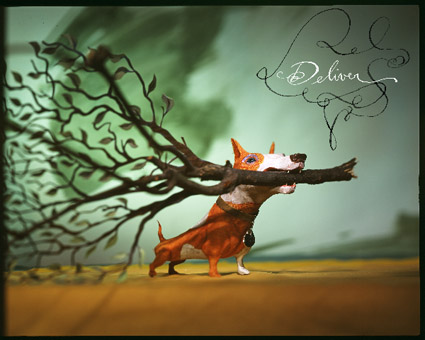
Francisco de Goya, Modo de volar (A Way of Flying) 1828